How to restore Firefox's classic theme after the Australis interface update
The Australis interface redesign landed in the Nightly channel today. It changes a lot of things around in the browser, and if you are unhappy with some of the changes, you may be glad to hear that a first extension has been released that lets you undo several of the changes that Mozilla introduced in Firefox 28 Nightly.
It needs to be noted that it is not clear when the new interface will hit the other channels, as Mozilla is currently contemplating if it should leave the new design in the Nightly channel until Firefox 29, and then move it to the other channels -- that is Aurora, Beta and Stable -- in the coming release cycles.
Australis makes lots of visual changes to the browser, from curved tabs to the removal of the add-on bar. Lets find out what Classic Theme Restore can undo.
Classic Theme Restorer
When you install the extension you are asked to restart the browser. Once you have done that, you will immediately notice several changes made to the interface:
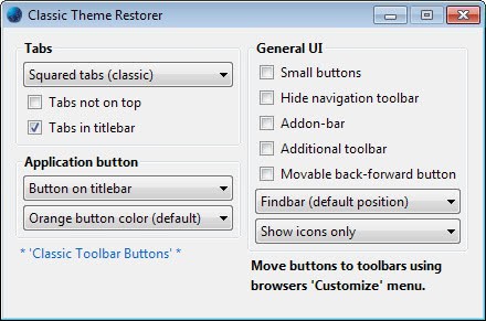
- Tabs in Firefox are squared again and not rounded anymore. You can now display more tabs again in the tab bar at the same time. You can modify that setting to display the curved tabs of the Australis interface, or an experimental curved tabs design.
- The Tabs are displayed in the title bar by default. You can change that so that they are displayed below the title bar.
- A Firefox button is displayed again in the upper left corner of the screen. It does not look exactly like the classic Firefox button, but offers the same functionality. The new three stripes menu is still also accessible on the right of the address bar. Here you can also change the color of the button, but not how it looks like.
- If you do not want the button, you can either hide it completely, or display it in the toolbar instead.
As far as options go, Classic Theme Restore makes available the following:
- Re-enable the add-on bar so that you can move your extension icons into it. You can also move other icons to it, like the Firefox search bar, and all other buttons and menus that are available in the customization interface. Just drag and drop them to the bar after you have enabled them.
- Enable small buttons to save space in the address bar and other toolbars.
- Hide the navigational toolbar.
- Add one additional toolbar to the browser. You can place icons in it as well.
- Enable movable back and forward buttons. What this means is that you can move the buttons independently -- meaning without the address bar -- to another location.
- Place the find bar in its default position, or at the bottom of the browser window.
- Show icons only, or icons and text, or text only.
- Display tabs on bottom and not on top.
In addition to the options displayed in the preferences of the extension, it adds other features to it that you may be interested in. This includes a whole array of buttons, bookmarks menu button, a reload and stop button, or the history and bookmarks sidebar buttons.
It is also making available spaces and flexible spaces that you can add to the interface, makes the urlbar and PanelUI button movable again, and offers reduced urlbars and windows min.-width values.
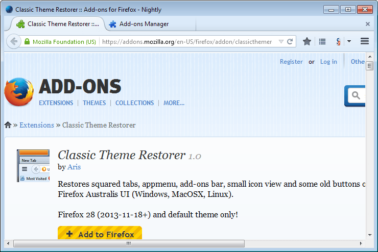
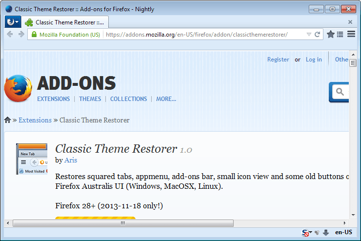
Want to see how it looks like? Here you go, before and after screenshots.
Please note that the new interface and the extension that restores Firefox's old interface are a work in progress. Things can change along the way, and it is likely that new options will be added to the extension, and that some features will be tweaked.
For now, this is as classic as it can get. If you dislike the changes, or some of them, you can use this extension to undo them to keep your sanity.
Extra Tip: Classic Bookmarks Button by the same author restores the classic bookmarks menu that Mozilla used in all versions of Firefox from 4 to 28.
It will be interesting to see how popular the add-on will get in the coming months. What's your take on this? Could this become the most popular add-on ever, or will it remain a niche extension that only some users will install and make use of?
Advertisement







After the first use the classic them restorer menu item disappeared from the tools menu. how do I get it back?
If it is still installed, click on the menu icon in the upper right corner and select customize. Drag and drop the icon back to the toolbar.
Many thanks for this brilliant addon.
I would really dislike leaving FF, as they seem determined to drive users away with unwanted, childish non-features and nonsensical sales talk, like a real multi-billion-dollar company.
Now I’ll stick with it thanks to the ad-blocking options, and your great work.
Thanks again and all the best. – Marq
Hello !
First of all, thank you very much for your add-on !
My (very little) problem is that my Application button stay white, I can’t get it back to orange (default), for example.
I guess there is an interaction with another add-on, but I couldn’t find which or what.
Does someone have an idea ?
My list of add-ons :
– Classic Theme Restorer
– Hide Caption Titlebar Plus
– Personnal Titlebar
– Tile Tabs
– Tree Style Tab
– Undo Closed Tabs Button
and Adblock Plus, DownloadHelper, Greasemonkey, Lazarus, NoScript, Redirect Cleaner, Restartless Restart, Self-Destructing Cookies, Smart Referer, Wot, X-notifier (but they are not aiming the skin of FF).
I like the old style; I was accustomed to it and the new style is confusing visually, as well as being less effective since I open and close tabs frequently, so I want them close to the content. So I like this add-on.
reverted back to 28
I think most people that haven’t quit outright have done this.
Absolutely brilliant extension. I would kiss the author if I could! Quite simply, it allowed me to get Australis looking somewhere near what Firefox looked like before Australis hit me today.
The options are plentiful and that is the way I like it! If you feared your favourite browser was “going all Chromey” and you didn’t know what to do, give this extension a go, I’d be surprised if you are disappointed.
One small criticism: I also installed the author’s “Classic Toolbar Buttons 1.3.7” and though they styled my buttons much better, I’m not able to put a separator between the Back and Forward buttons, which I like. I can do so with the Reload | Stop buttons but that’s not unusual. The combination of the Back and Forward buttons seems to be a bit of a bugger for extension authors to revert, or am I just missing a setting somewhere?
Classic theme restorer really only restores some of the pre-Australis functionality. This change to Firefox is a mistake but no matter how much of the user base hates it, I suppose the Firefox development team won’t listen.
@Nazcalito A few days ago Mozilla came out with a survey they’ve created where you can give them feedback on Firefox Australis. However, for it to be truly meaningful to the Folks at Mozilla, you should download, install, and use a nightly release of this new-look browser. Just telling them you won’t like what they’re proposing isn’t enough as Mozilla wants to know exactly what you find objectionable.
I have Firefox 26.0 and am not able to install Classic Theme Restorer. It says: “Not available for Firefox 26” Do I need Australis before I can install the add-on to eliminate it?
Yes that is right Craig.
Okay. In a perfect world, there would be an add-on to prevent Australis in the first place. Sigh.
Guys, Martin, I’m unable to get the Firefox Menu Button to sit small and pretty like in the screenshot here on this page. :-( Using the Classic Theme Restorer && I’ve tried, both, the UI Fixer and the Movable Firefox Button to no avail. How can it be done, please?
P.S. The regular, ‘big’, one is ugly and out-of-place by a lot of pixels. :f
You need to select Button on Toolbar for that in the options.
Hi WYZ,
Hello friend. You are so right. This is all about market sharing and, of course, big $$$. That’s really the issue here and it seems that we, FF loyal users, aren’t really important. We are just a number on a piece of paper. Sad that this is happening. I just hope that Mozilla has a reality awakening. WAKE UP MOZILLA……
When I read of Mozilla’s new design months ago I shook my head in disgust knowing their minimalist look browser would be a problem. I wondered how a Firefox power user like myself, with 60+ extensions, numerous toolbars and panels, and a bookmark bar with over 16,000 entries, would be able to easily access things in Australis. As designed I can’t. The main toolbar has assigned areas for web addresses and search but doesn’t have very much room allotted for launch icons, especially if you’re as extension crazy as I am. With Mozilla taking toolbar and panel options away what is a user to do. Burying them several clicks in a menu is not what I consider easy access. Let’s face it folks, Mozilla is not going to have an epiphany and stop Australis development, nor are they going to rethink the design to better accommodate power users who customize heavily. What’s left? That’s right, extensions.
It may not address all the problems Australis will cause but Classic Theme Restorer is a very good start. In the past if there was a release that messed things up it usually took anywhere from a few days to a few months before extension developers would come out with an add-on to rectify the problem. Stop and think how much better off we are today. With five full months before the scheduled release of Austalis Aris, a Mozilla developer, is well along with an extension to restore lost features and functions. If something is ready now it should give you some idea of the level of protestation Australis has caused, and how important Mozilla is taking these complaints to have an employee working on a third party extension. Also bear in mind this is only one developer and one extension. We shouldn’t underestimated how creative people can be in solving problems. When all is said and done there will likely be a number of add-on extensions to address the shortcomings of Australis, and who knows, maybe this new UI will also inspire extension developers to come up with add-ons that will expand on what FEW good features Australis has! ;-)
As for Pale Moon, well, it’s not an option for me as a Linux user. I’m not really all that comfortable with the idea this program will continue to be maintained as the code differences between the two browsers becomes greater and greater over time. For the sake of all those people who are banking on it being their savior in this time of crisis you better pray I’m wrong. LOL
Concerning Pale Moon, I just hope that the code between FF and PM don’t differentiate a lot and that we, who are on Pale Moon, won’t be affected over time. It’s a pity that Mozilla doesn’t take the so many comments that their loyal FF users are expressing on so my blogs and sites across the Internet. Many of us have adopted FF as our main browser and left Internet Explorer and others because we happen to like FF for being so versatile and for all the extensions it offers. Australis is a MONSTER we don’t want. Are you listening Mozilla???
@ George Melendez Sadly the comments of so many long time Firefox users protesting the implementation of the Australis UI are falling on deaf ears. The trend pandering folks at Mozilla have forsaken their long established identity of being customize friendly for a greater share in the small devise market. Having a similar look and feel from the largest desktop to the smallest hand held devise is now the new identity. All those years of being a loyal user aren’t worth a handful of beans because to Mozilla you’re simply cannon fodder in the war for greater market share.
Among the better add-ons.
The Mozilla developers must be a bunch of idiots. Firefox should not look like
Chrome unless there is option for the old look.
Mozilla effectively was bought by google some years ago. Google is the source of most of Mozilla’s revenues: Have a look at http://static.mozilla.com/moco/en-US/pdf/Mozilla%20Foundation%20and%20Subsidiaries%202011%20Audited%20Financial%20Statement.pdf#page=20 , especially Note 8: “Mozilla entered into a contract with a search
engine provider [that is Google] for royalties which expires November 2014. The previous contract term expired in November 2011. Approximately 85% and 84% of royalty revenue for 2011 and 2010, respectively, was derived from this contract. The receivable from this search engine provider represented 77% and 64% of the December 31, 2011 and 2010 outstanding receivables, respectively.”
Mozilla thus does what Google says and lets Google dictate the way the web will look and feel in the future. Thus Firefox gets more and more chromish. If you have a look at https://blog.mozilla.org/ux/who-we-are/ you’ll notice that at least two of Mozilla’s UX developers used to be on Google’s payroll (and maybe still are).
So no, I guess Mozillas devs are not a bunch of idiots. They ruin Firefox on purpose. They do what they are paid for. By Google.
If this is all true, not putting your integrity in doubt, then why is Mozilla still asking for donations??? If I’m correct, Mozilla presents it self as a “non-profit organization”. Am I correct on this???
On Windows, I use Waterfox. Better than Pale Moon.
On Linux, I’ve reverted to the last nightly before this UI change. I’ll try out this extension. In particular, I really hate having the tabbar on top, above the toolbars. I want the tabbar next to the actual tabs.
@ Joe Yes, I too hate the tabbar on top!
Another Pale Moon user…. Sorry Firefox…….
I just installed Pale Moon x64, ran it with the /profilemanager option and pointed it to my Firefox profile. Boom, back to old Firefox.
What has gone wrong inside Mozilla that they think it would be a good idea to shove such a junk interface down our throats? The tab heights in Australis are easily 25% bigger than they need to be. Not to mention it broke a bunch of addons that are displayed in the Addon bar. The whole reason I moved from IE to FF back before version 1.0 was because it gave me CHOICES. So long regular Firefox, we had a good run.
Hello friends,
Just installed Pale Moon and this browser really works like a charm. I migrated all my stuff for Fire Fox and I’m surprised at how similar they are. Really can’t see any visual difference but the speed of Pale Moon is impressive and had no problems at all installing and migrating all my bookmarks and extensions from FF. This is just great to know that even thought FF will be implementing Australis that I can still have what I like and use as my default browser. May I say that, after using Pale Moon, now Pale Moon is my preferred browser. It’s my default browser now. So if any of you are concerned about losing your FF as your preferred browser I would suggest trying Pale Moon. I did and love it.
> I did not measure it but I compared screenshots and Australis appeared to use more space than classic tabs.
…ok…
I’m not some particular proponent of Australis, but I think the empirical data should be considered. I just remeasured and came up with the same results as last time between Australis (on Nightly) and the current theme. The distance from the left-most pixel in the icon on one tab to the left-most pixel in the icon on an adjacent tab (non-inclusive) is exactly 100 pixels in both themes. (That is, with tabs at their default minimum width because the tab bar has gone past its max tab limit.) The curvy, selected tab has no affect on this.
So Australis tabs do not use more space than classic tabs.
In circumstances where there is *no* resizing of tabs (just a few tabs open) Australis tabs are 180 pixels while classic is 250 pixels – notably larger.
This is on a Windows 7 system. I don’t know if the pixels will match up on other platforms, but I would expect the comparisons to be consistent.
http://i.imgur.com/H9JP3oI.png
I see, maybe it is because I have set the minimum tab width to a lower value in Firefox then.
Hello friends,
Just installed Pale Moon and this browser really works like a charm. I migrated all my stuff for Fire Fox and I’m surprised at how similar they are. Really can’t see any visual difference but the speed of Pale Moon is impressive and had no problems at all installing and migrating all my bookmarks and extensions from FF. This is just great to know that even thought FF will be implementing Australis that I can still have what I like and use as my default browser. May I say that, after using Pale Moon, now Pale Moon is my . So if any of you are concerned about losing your FF as your preferred browser I would suggest trying Pale Moon. I did and love it.
Martin,
The link for Classic Theme Restorer goes to…
Just kidding.
It will be a widely popular add-on thanks to its offerings and thanks to you.
Others will follow your lead with writing about it.
I believe that you mentioned it before Sören a while back, but I could be wrong.
In any event, two great authors, even though Google translate sucks and does a weak job with translating his site.
The only issue or roadblock that I’ve faced that I couldn’t fix myself so far in Australis is the add-on bar. It has irked me that it is gone. This add-on fixes that and I’m guessing that the Status-4-Evar developer will address that and other things eventually due to its popularity and usage.
Martin,
The link for Classic Theme Restorer goes to … the Chrome download page :p
Latest and not so latest Chrome versions on Win 7 machines (I have tried two separate ones with different graphics, both with lots of RAM but not latest CPU) and flash have this irritating ‘bug’ that make youtube and other flash videos make a ‘skipping sound’ when switching tabs. So I am staying on FF for now, perhaps Pale Moon or may be I should google the Chrome issue too …
only after uninstalled “Masking Agent” I was able to install the Classic Theme Restore extension. Thanks.
You said: “You can now display more tabs again in the tab bar at the same time.”
What did you mean by that?
The curved tabs are slightly wider than the classic tabs.
I was curious a while ago so I did a pixel measurement/comparison between Nightly and UX. I filled up the tab bar until it was one tab past capacity (in order to get to the minimum tab width) and found that the tabs were exactly the same width – both in Australis and Nightly. The same number of tabs fit in the same space. Only the selected tab, the one with curves, *appeared* wider, however it actually overlaps the adjacent tabs (down at the bottom, the tail of the curve). Nothing shifts when it is selected. It is the same width as all the others.
So the idea that it would fit fewer tabs was an assumption based on my perception.
There is the possibility that they’ve changed it since then, but I imagine keeping the tab size the same was intentional so I wouldn’t expect it.
I did not measure it but I compared screenshots and Australis appeared to use more space than classic tabs.
Nightly installed v28.0a1 (20134-11-18)
Yes latest update v28a
http://ipkill.org/notavailableforfirefox
Well it seems that the Mozilla site identified your version as 27 and not 28?
Martin I have F28a also not work
Works fine for me. Have you installed the latest Nightly update and use Australis currently?
Classic Theme Restorer Not available for Firefox 27.0
http://ipkill.org/notavailableforfirefox
It is not necessary as Australis was added to Fx 28.
Thanks Martin. Links bookmarked.
As I’ve said already, the main reason for switching from Firefox to Pale Moon was not the Australis “revolution” when the code optimization and the 64-bit build option, but that avoiding Australis was and remains the happiest side-effect.
I share the idea that “It will be interesting to see how popular the add-on will get in the coming months.”, and my belief now is that it is and will appear to be unpopular. On another hand a human characteristic being that of adaptability, perhaps the cries will vanish with time, which would testify more of that adaptability than of the pertinence of Australis.
Who knows ? Maybe will Australis appear to be such a mistake that future versions return to a previous concept of what Firefox was and should stay: smart.
@ Transcontinental Firefox Australis is far to big a commitment for Mozilla to return to a previous version. Sadly, as much as I like the present setup, I don’t think that will ever happen.
They might not be able to revert, but that doesn’t mean they can’t refine. Extension authors are clearly displaying that it’s possible to make Australis look and feel like an older Firefox version. The critical question is: will Mozilla keep supporting the ability for Add-On authors to do so. If yes, then why can’t Mozilla simply build a “Classic” and an “Australis” mode? Too much work? Perhaps. Do they also want to remove these customization ‘hooks’ in the future? If so, then that’s a problem IMHO.
If this is possible, which is seems to be, then Mozilla should support a classic mode and an Australis mode. To be honest, Mozilla are that willing to dismiss users who don’t want UI changes forced on them, I’m surprised they allow a developer like Aris to achieve what he has achieved.
Is there a way to get the search bar back?
The search bar is still displayed by default, so yes, it is still there.
But for how long Martin?
The link for Classic Theme Restore doesn’t go to that add-on, it goes to the Classic Bookmarks Button add-on.
Classic Theme Restore add-on isn’t even listed on Mozilla’s Add-on site…. How did you get a screenshot of a page that doesn’t even exist?
Guess the author doesn’t want the masses to test it yet.
Fixed the link, sorry for that.
correct link
https://addons.mozilla.org/en-US/firefox/addon/classicthemerestorer/
Thanks, fixed.
Used it only to get the addon bar back. Am pretty happy with the way Australis looks otherwise. One irritating thing with the nightly is it doesn’t remember custom positioning. So icons removed from the addon bar or icons moved to the addon bar get reset to the way they were after restarting FF. Grrr. Hopefully that gets fixed.
Since you are just using it because of the addon bar, you may want to install an extension I made: https://addons.mozilla.org/addon/the-addon-bar
It works closer to how the original addon bar works than the one included in Classic Theme Restorer. (I.E. supports ctrl + / toggle key, and styled exactly like the old one.)
@ Tehmul Ghyara Yes, it’s a bug that would drive everyone crazy! With almost 5 full months before the scheduled release of Firefox Australis you can be pretty sure this problem will be taken care of.
Use the addon ‘Status-4-Evar’ :)
The status/add-on bar feature of Classic Theme Restorer is a handy option but at this point (very early days) I’m sticking with Status-4-Evar (the latest beta version: 2014-01-29.16b) for the time being. The author , “Sparky Bluefang”, deserves support.
I have pretty much given up on FF.
Long live Pale Moon.
You said it! And I approve!
I applaud Aris for the work he’s put into this addon, but as the saying goes “You can’t polish a turd”.
I applaud Aris for the work he’s put in and I think he has been able to polish the turd, though I understand everyone has different expectations. That is what Firefox was built on: the ability for people to customize it to their preferences. Australis really compromises that for what, rounded tabs and a Chrome-copied app menu? Firefox doesn’t gain anything else from Australis.
It looks like you linked to Classic Bookmarks Button instead of Classic Theme Restorer.
Fixed, sorry for that.
The link for Classic Theme Restorer goes to the bookmark extension. I can’t find the theme one. ????
It is fixed now Bobby.
I just can’t understand WHY they want to make FF look more like Chrome. Not a smart move.
@ Rick The increased use of smart phones and tablets is why we are seeing the minimalist look. While they are not going to replace desktop computers anytime in the near future their popularity will continue to grow. It’s simply trend pandering on the part of Google and Mozilla, with all parties looking for a greater share in this high growth market.
Your link to Classic Theme Restore points to Classic Bookmarks Button.
I tried searching Aris’ list of addons but didn’t see Classic Theme Restore listed there: https://addons.mozilla.org/en-US/firefox/user/aris-t2/?page=1
Am I missing something? Where can I install this add-on?
I have fixed the link.
Martin, your link above for ‘Classic Theme Restore’ is actually pointing to ‘Classic Bookmarks Button’ also by Aris.
It is fixed now Dougle.
Looks like both links go to the Classic Bookmarks Button page.
It is fixed now.
The link for classic theme restorer download is wrong. please fix it.
Done, sorry for that.
Using Pale Moon 99% of the time,I won’t update Firefox to Australis,like it the way I have it.
Pale Moon…. so am I. Sticking with Pale Moon which is built on Firefox platform. It’s almost identical to FF and it’s faster. Pale Moon, you can migrate all your bookmarks and extensions and plugins, they all work just fine with Pale Moon. I just started using Pale Moon a few days ago and I’m very pleased and it’s actually my default browser now. So if you are concerned with all the hype of the new Australis thing just try Pale Moon and maybe you will be convinced like I am. Pale Moon is just GREAT…….
thank you for the information
oh man,thans for your comment,i try pale moon,he is perfect,
GREAT….
@ Mike Sadly Pale Moon is not an option for Linux users, at least not at this time.
Same here!
its nearly that ,nice job but it would appreciate to restore the histori button like before,you know the 1 who open the left scrolling column on the page,now we have to open histori box if we want to see more,