Google rolling out search tools on top
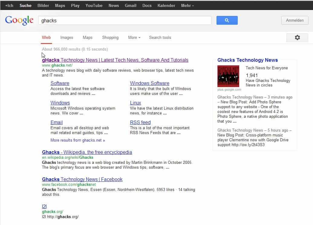
If you are in the US You may have noticed a change on Google Search in the last few hours where the traditional sidebar has been moved to the top of the search results right beneath the search form. The sidebar offered quick links to various specialized searches, like Google Shopping, News or Images, as well as tools that one could use to limit results to a certain time frame or to other factors such as location, reading level or sites with images.
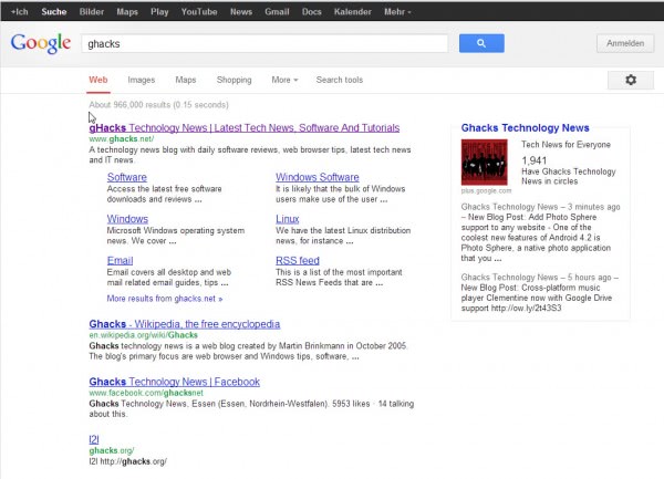
The new layout displays only a handful of links above the search results: Web, Images, Maps, Shopping, More and Search Tools. The more link displays other specialized Google Search engines, like Recipes, Flights, Blogs or Books which can be selected from the menu. The Search Tools button displays a second row beneath the first that you can use to specify time and result based parameters to filter the results.
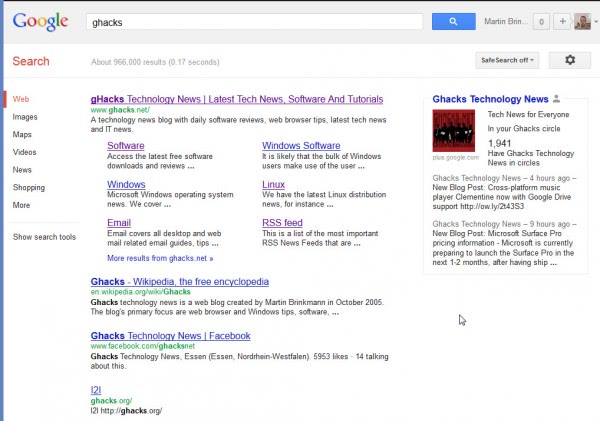
Below are two screenshots. First the old Google design with the search options and tools on the left in the sidebar adjacent to the search results, and then the new search layout where the sidebar area is white, and the search options and tools are placed on top of the results. You can click on the images to load a larger version of them in the browser.
The new design raises several questions. First, what is going to happen with the sidebar area that is now completely white? You may remember that Google used whitespace previously on other properties when design changes were rolled out in several steps.
Second, will the new layout increase user interaction with the new search bar, and if it does, will it change the way Google users access websites? Or will it have less of an impact and even increase the number of sites Google users visit per search query?
If you have been using time or result based search tools, you may also notice that the new layout requires one additional click to select a time or result based filter. Previously, all it took was two clicks. Now, you need to click on Search Tools, then on Any Time or All Results, and then on the actual item that you want to use.
It was first reported that the change is only affecting US users of Google. I can however confirm that I see the change as well, and reports on Twitter seem to suggest that the rollout is not limited to US users. I'm however not sure if it is limited to google.com, or if localized search properties are also moved to the new layout right now.
Are you seeing the new Google search layout right now with the search tools on top? If so, what is your take on the change in general? Also, any ideas as to what Google will do with the white sidebar area?
We have first seen the change in July of 2012 when it was rolled to a test sample of users visiting the Google website. Reports are now coming in by many users that they see the Google sidebar links on top which suggests that the feature is being rolled out right now.
Update: It is official, Google is changing the layout of the search results page.
Advertisement










I have the same problem as Claire. When I click on Search Tools the extra horiontal menu appears for a fraction of a second and then disappears. It works fine in Firefox and Internet Explorer, but NOT Chrome!
I have the same glitch as Rick H – but I’m not using Firefox, I’m using Chrome. Sometimes clicking on “Search tools” bounces me back to the last search and sometimes it teasingly opens the extra options for a tenth of a second before closing them again. It’s really annoying as I am getting all sorts of US and Australian results for my searches and I want to be able to select “pages from the UK” but can’t.
In Firefox, there’s a nasty glitch with the new “Search Tools” hoax – it doesn’t offer advanced filters, but clicking on the button actually BOUNCES me to the last google search I made! Google’s search engine has become totally useless, since I can never see results which are recent and not mixed in with random nonsense from the previous decade. Nice going.
just went onto google & have the bar moved to the top, hate it, makes things a bit harder to use as it takes longer to do stuff.
was perfectly happy with the search tolls been listed down the side, didn’t need moving in my opinion :(
i Hate the new style of google.com.
thumbs down!!!!
As with other latest Google changes, I don’t like this one too. May be it has some use for tablets but with 16:9 _widescreen_ PCs / notebooks / netbooks who needs something moved to top from side, really?
More clicks to get what I want. Doesn’t seem like an improvement
I noticed the new menu late this afternoon (Pacific Time). Now I’ve got two horizontal menus – the black bar, and the repositioned white bar.
Not thrilled – it’s a waste of space to have two top menus, most of which is duplication, and because the white bar now is not locked – the options will vary depending on the last item the user chooses from the More Tools dropdown, so one can no longer flit up to the menu expecting to see “News” there, and finding “Video” instead. Gah!
It seems they’ve reduced their image search size filter to – any size – large -medium – icon. No more “larger than 2mb” etc options, which is not making me happy. Often I search exclusively for very large photos and the new “large” search results are not yielding many big pics.
Same as Roebie, here in France : on google.com/ncr but not on google.fr
This new Google Search layout would more than ever IMO take advantage of a fixed top-bar, enabling quick search changes without having to scroll back to top. Perhaps a script/style will handle that.
N/A in Canada, yet, but coming soon, for sure!
Well, I noticed this over the last week or 2 in the UK, but on looking today it is back to normal!
Strictly no change in France, that one is connected or not.
It’s not on google.co.uk yet, but had a play on encrypted.google.com and find the old version much more user friendly/functional. I don’t understand the logic of changing it for the sake of changing it.
I see it on google.com/ncr but not on google.be (at this time).
A pity time and result based filters need an extra click. I did notice however that the new layout has more result based filters than the old layout. Compared to the old layout on google.be the new layout has these new filters:
– Related searches
– Visited pages
– Not yet visited
– Personal
– Nearby